Typography
|
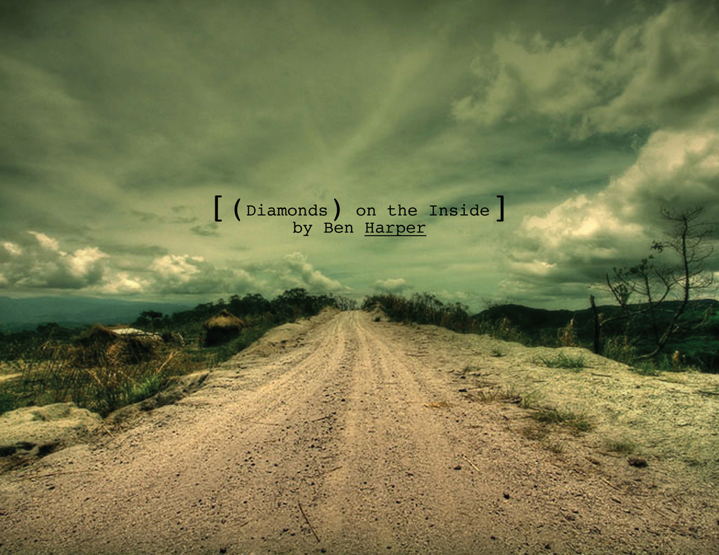
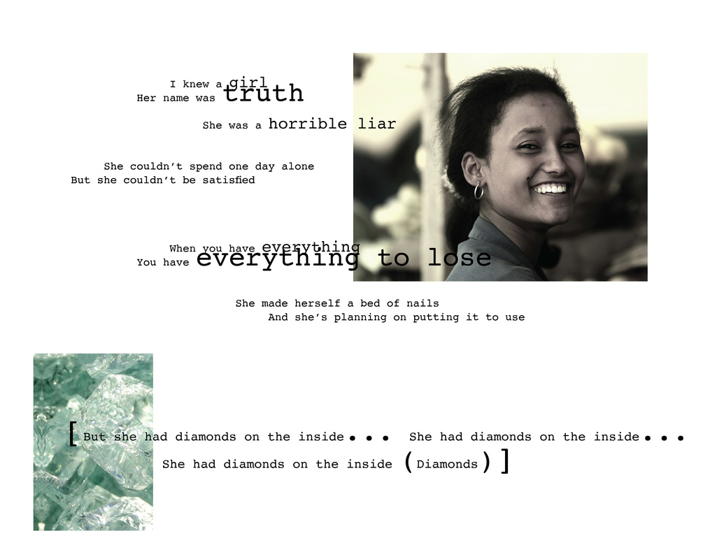
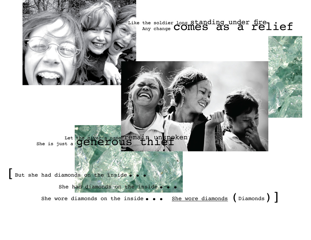
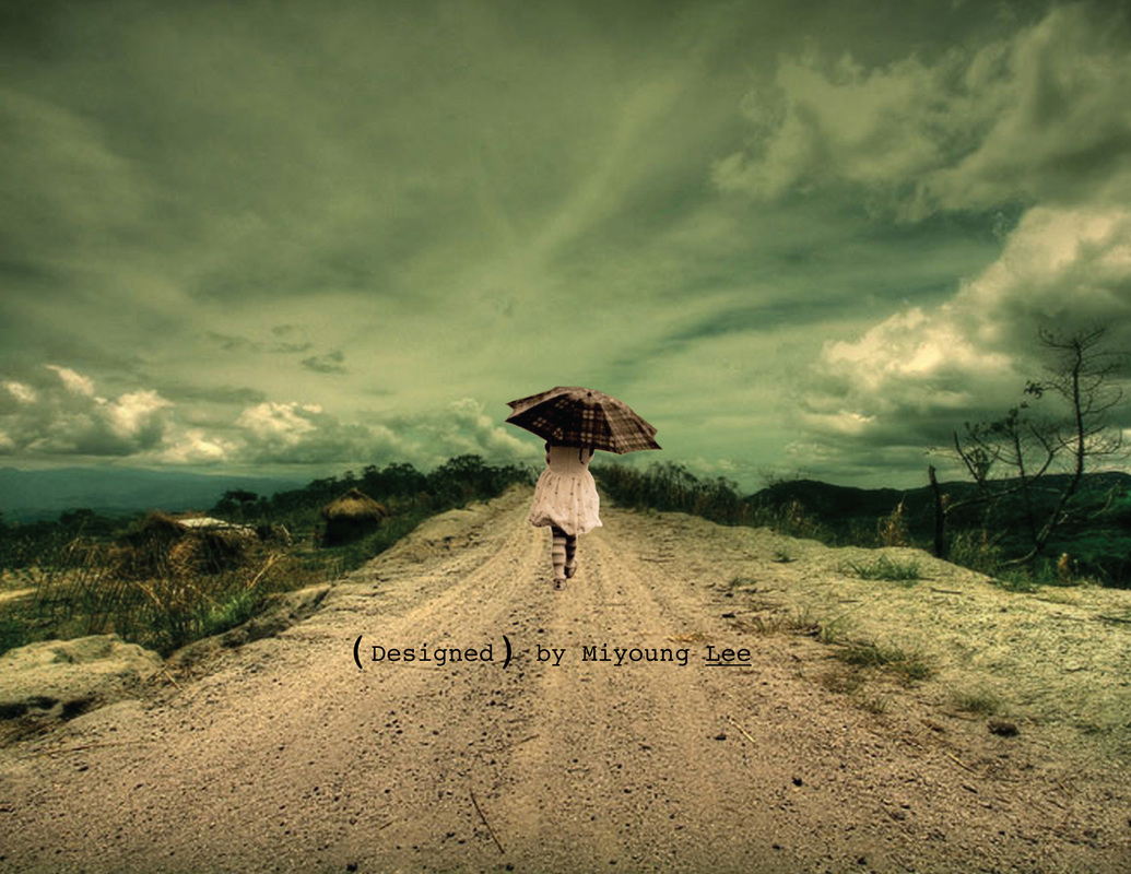
Song Book
One of my favorite songs is Diamonds on the Inside by Ben Harper. Typographically, I emphasized and differentiated particular words and phrases by the way it's performed by Ben Harper. There are a variety of images representing different types of girls who are all essentially diamonds in the rough and hopefully they will always be authentic to themselves because they have (diamonds on the inside) no matter what challenges they experience on their personal journeys. Identity Design
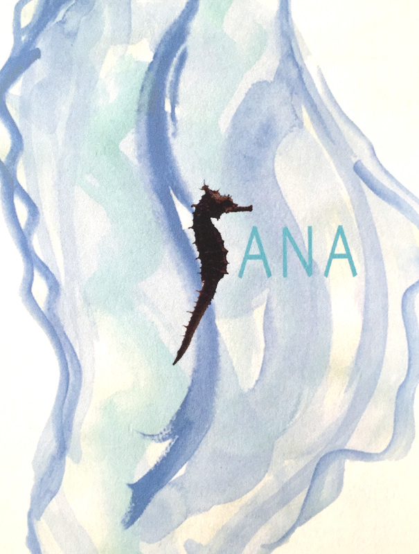
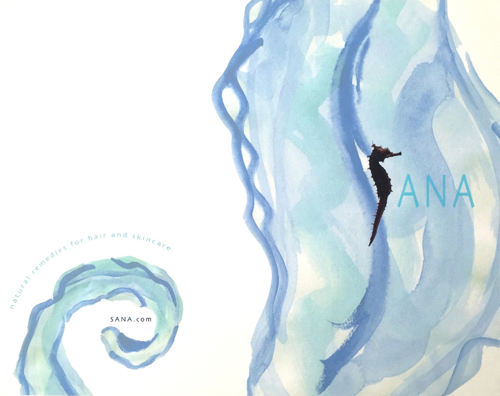
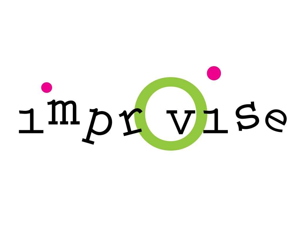
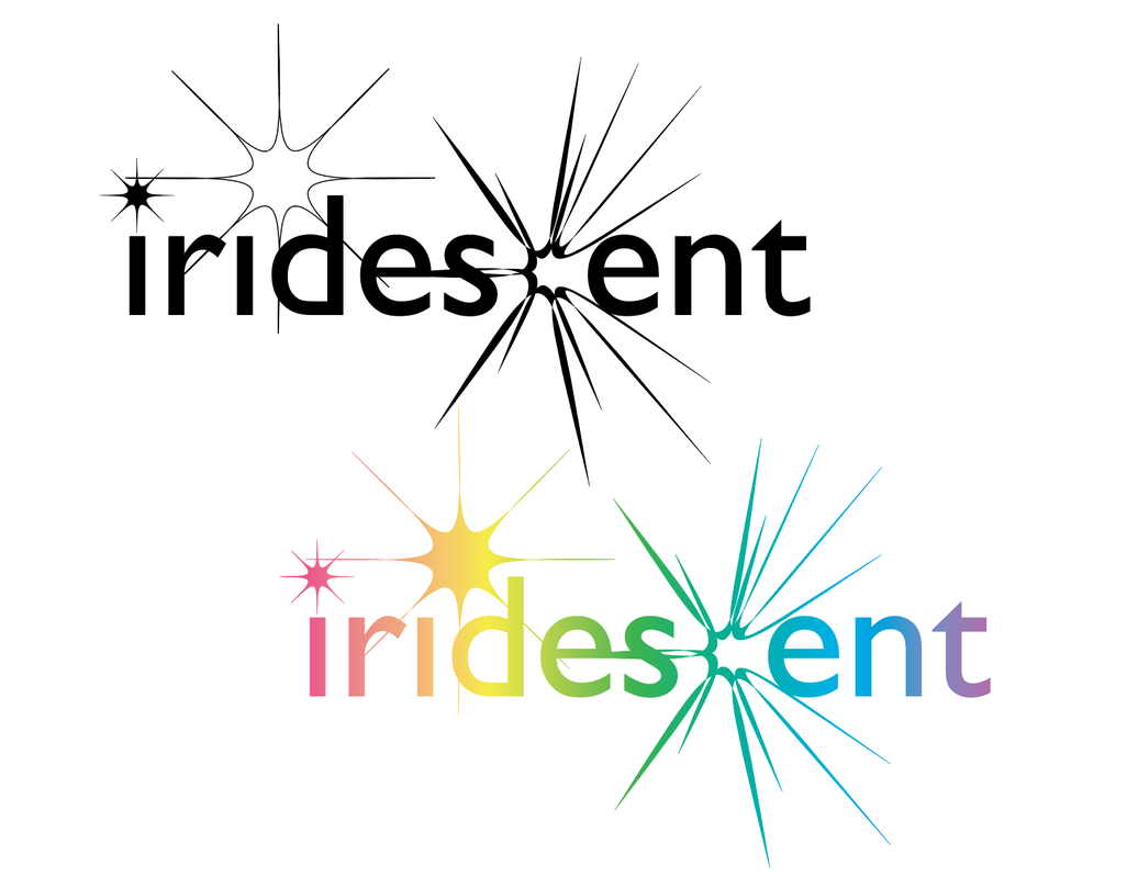
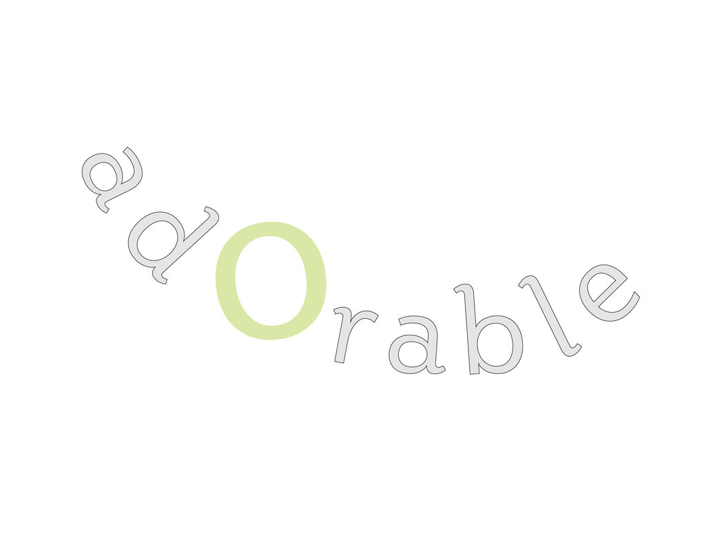
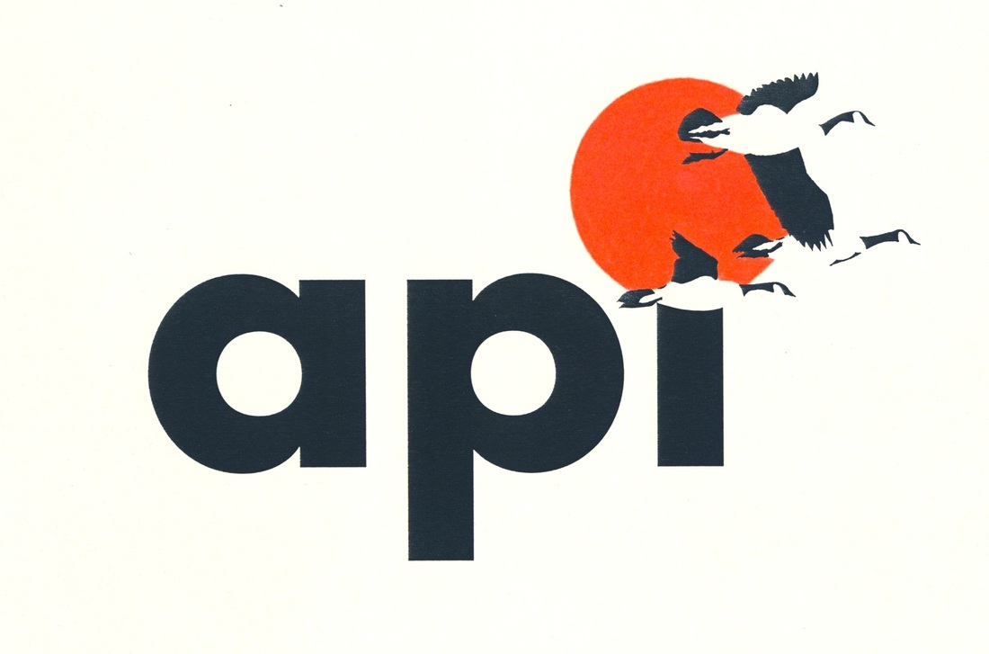
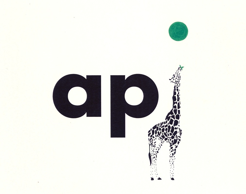
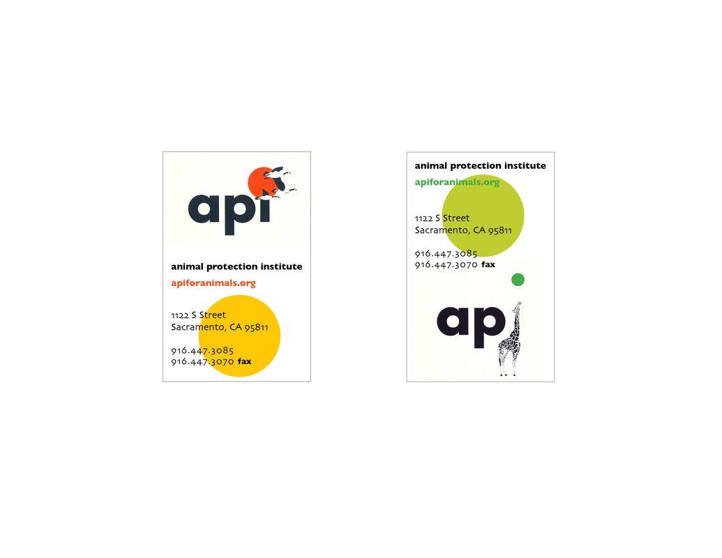
Below are several personal projects exploring identity design combining image and text and pure typography to represent a concept whether it is for a business, expressive word, non-profit organization or brand.
Poster Design
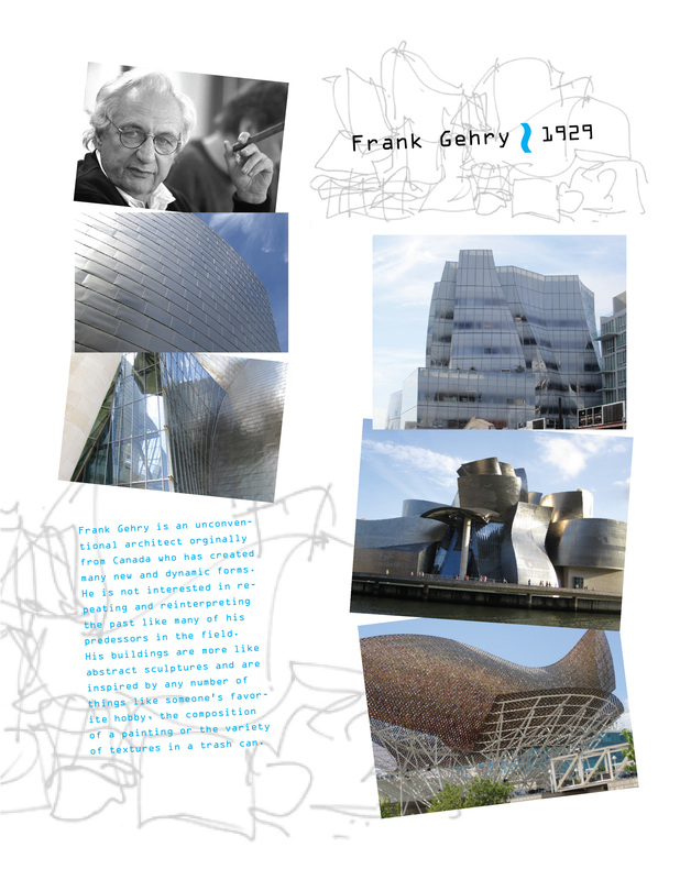
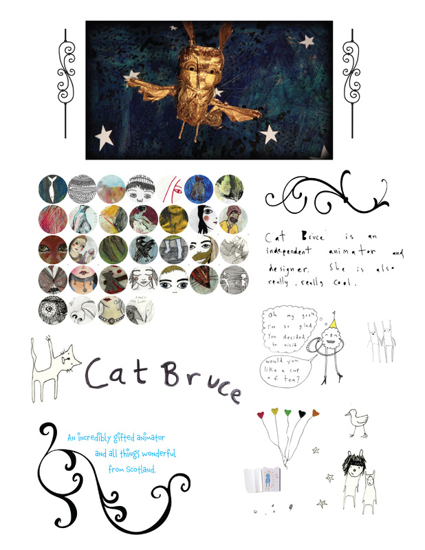
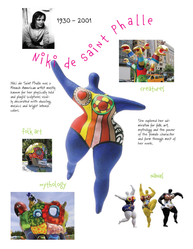
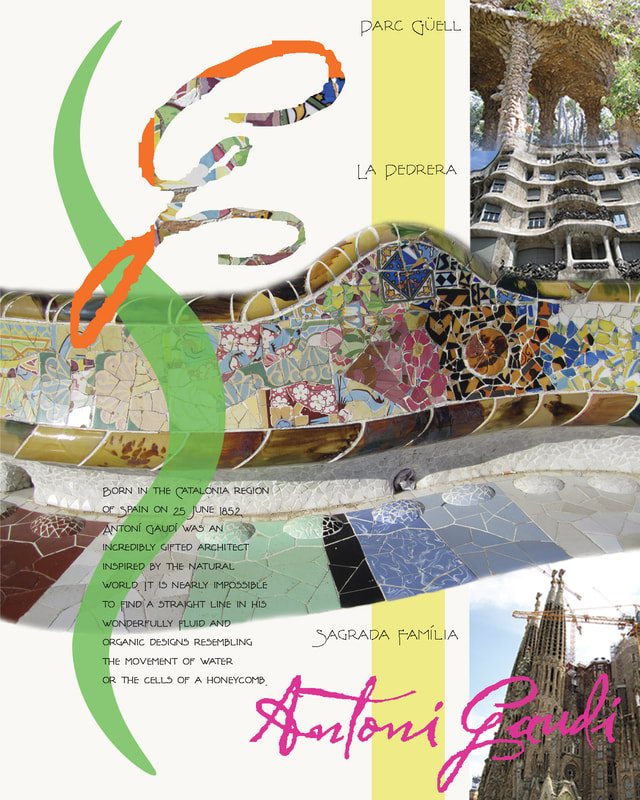
This series of posters was inspired by some of my favorite contemporary artists such as Frank Gehry, Cat Bruce, El Anatsui and Niki de Saint Phalle . . . I tried to represent each artist's style with the composition and various design elements.
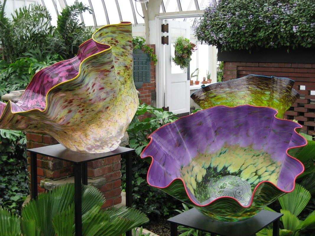
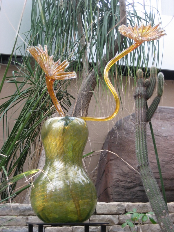
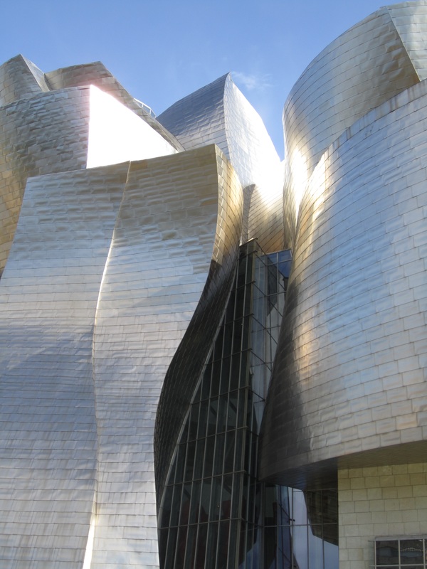
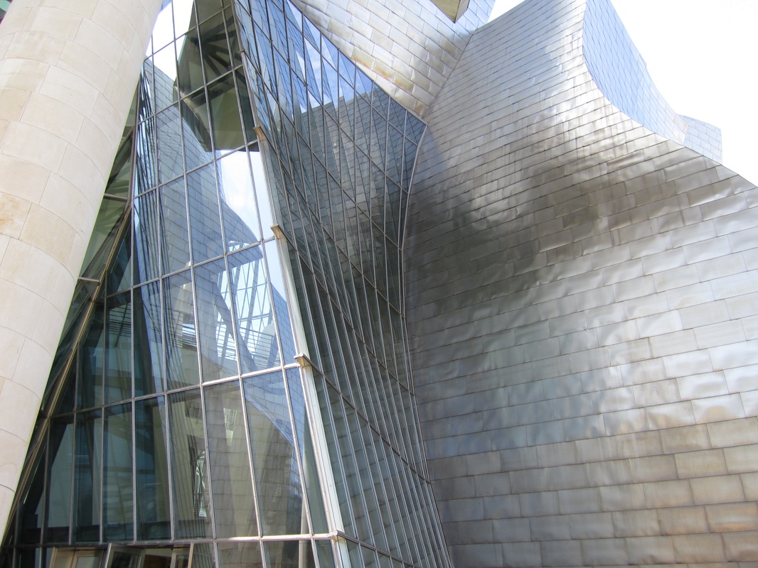
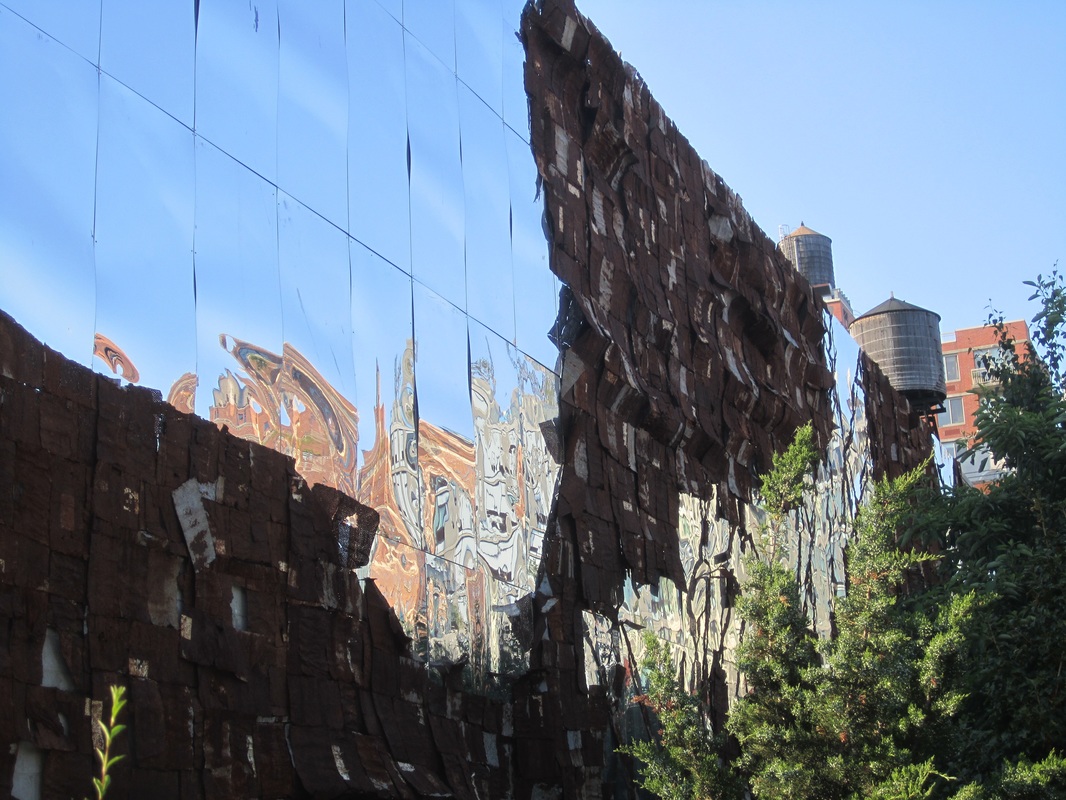
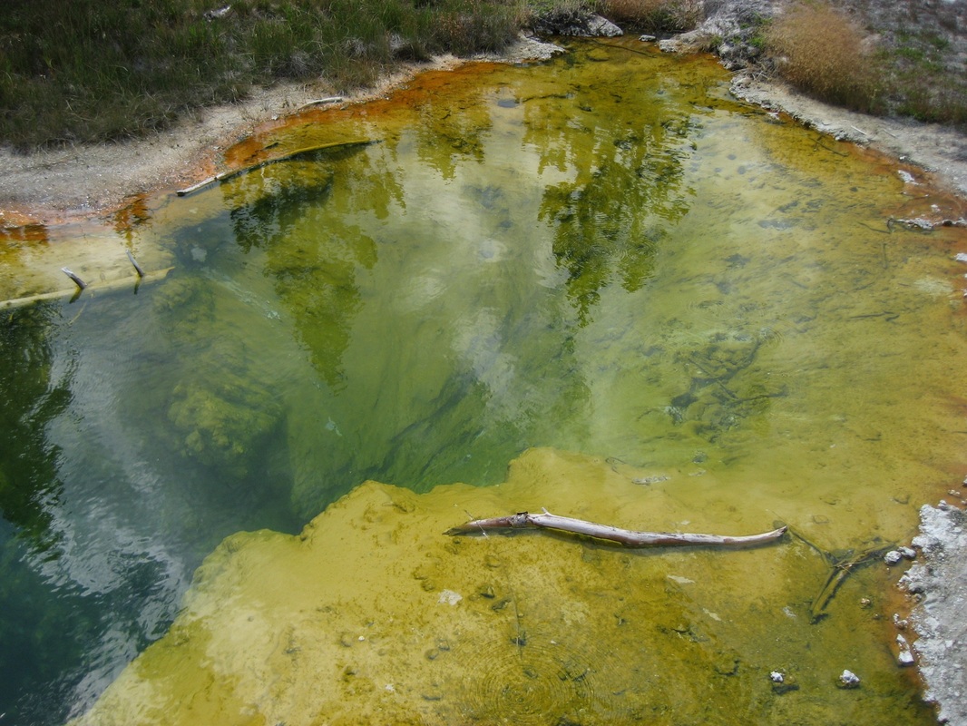
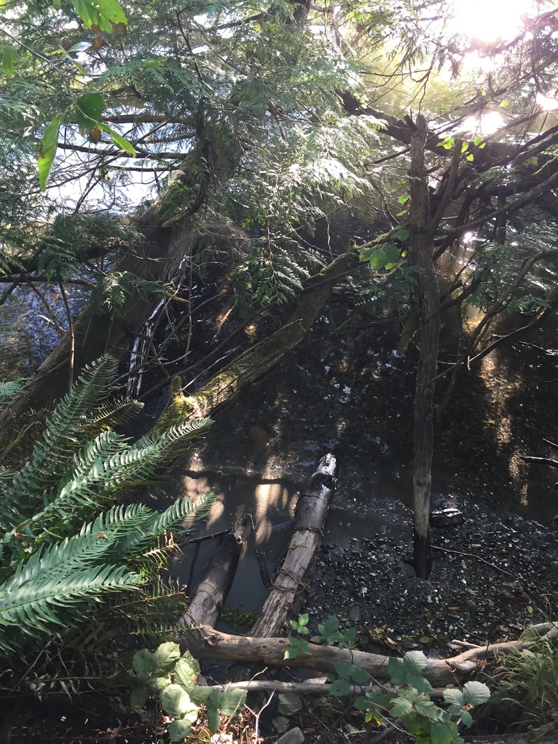
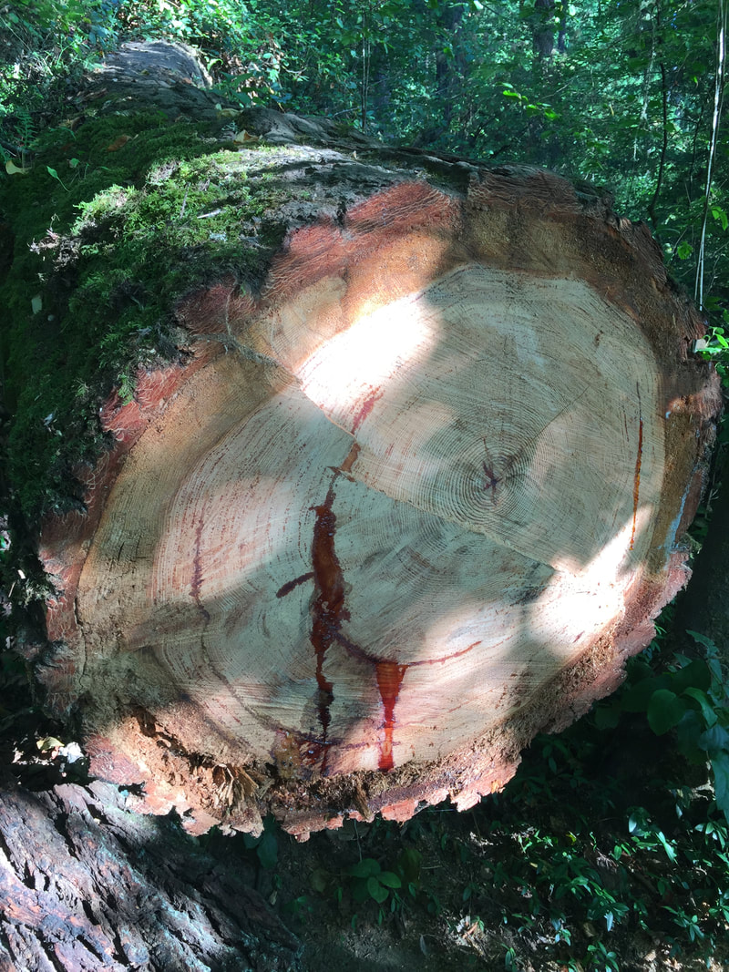
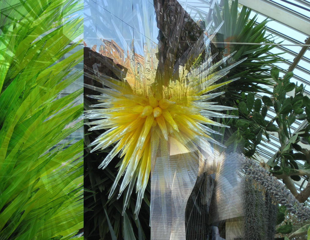
Digital PhotographyLike most people when I visit a place, I want to document what I am fascinated by whether it is an iconic landmark, architecture, natural beauty or great works of art by people I admire like Dale Chihuly, Frank Gehry and El Anatsui. I try to keep in mind the concepts I learned in my black and white photography classes about composition like positive and negative space, noticing patterns or movement, colors, textures, point of view and cropping. Even though anyone can easily take a photograph digitally and edit it in Photoshop, I still try to make each frame as interesting as possible and compositionally strong from the very beginning.
|
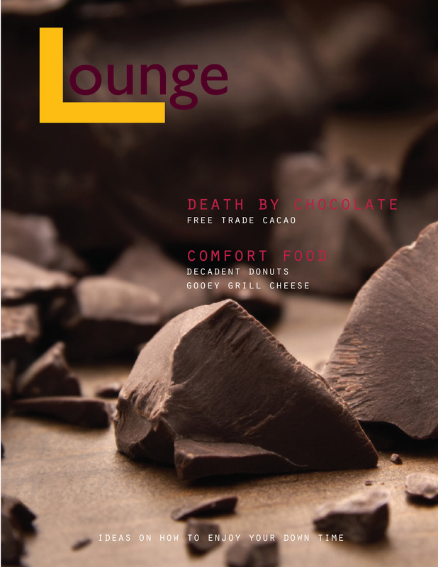
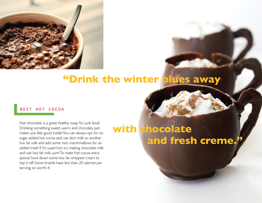
Magazine Layout
A side project I've been toying with is creating an on-line magazine that would celebrate the art of lounging or simply relaxing and being in the moment. There would be a variety of sections covering a range of topics like a book review for reading material, things to watch and listen to, and simple recipes to enjoy time in the kitchen. A variety of people (my friends and colleagues) would contribute a piece based on their personal interests to create a collaborative space for their ideas. Hand Lettering
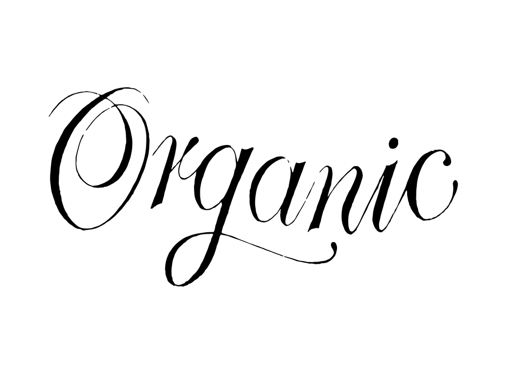
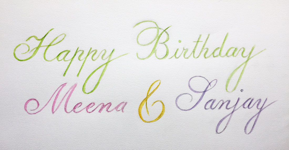
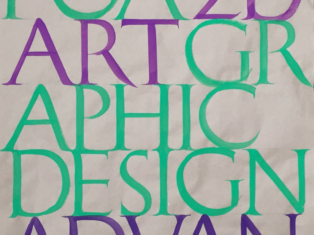
My fascination with hand lettering started with my love for typography. I am not a bonafide type nerd but whenever I see an incredible typeface in a magazine, logo or at the local grocery store with fabulous signage, I have to know what typeface the designer used but then I realize, I can probably create it myself by drawing the letterforms myself.
Web Design
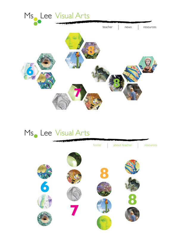
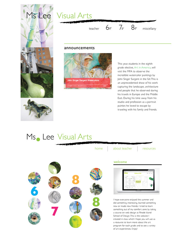
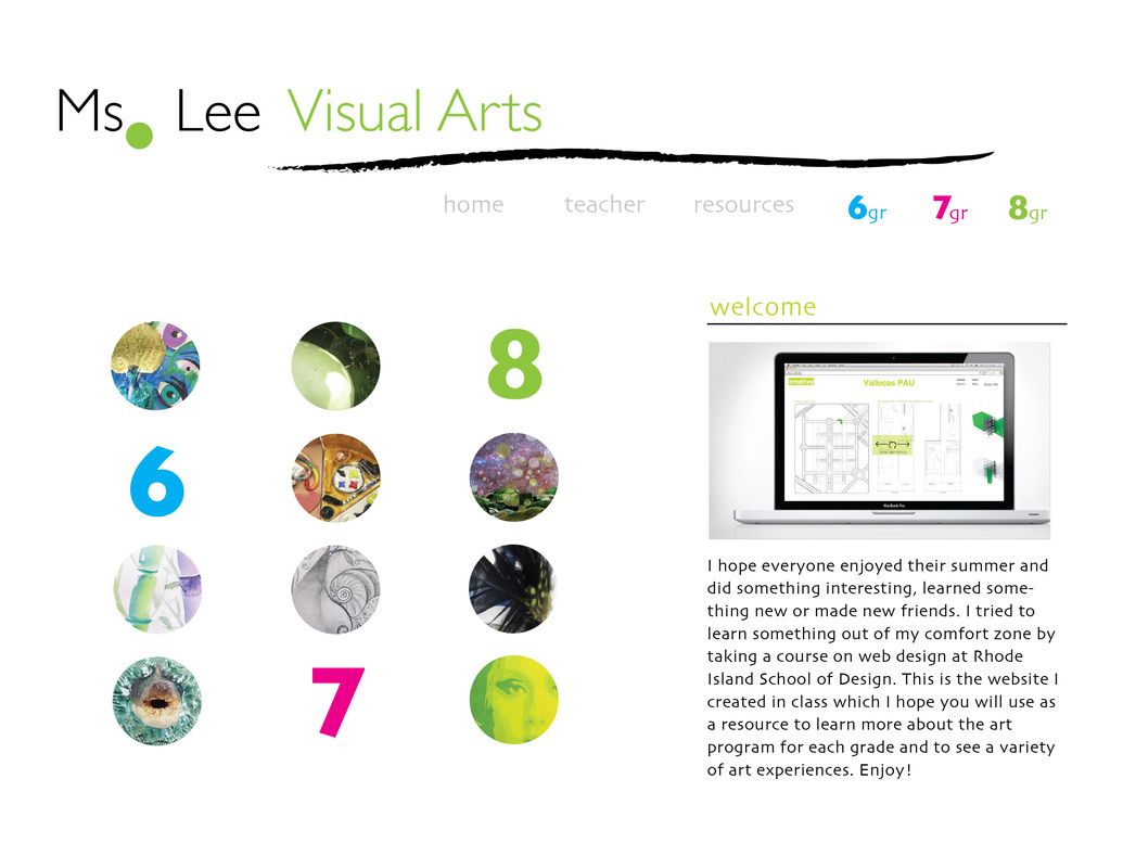
Before I developed the final design for my middle school website, I brainstormed different compositions for the homepage and navigation bar in Illustrator. I wanted the design to be informative but also playful so my students would want to visit the site, and parents or the administration would also be able to learn about the middle school curriculum. Below are variations of the look and feel I wanted to create.
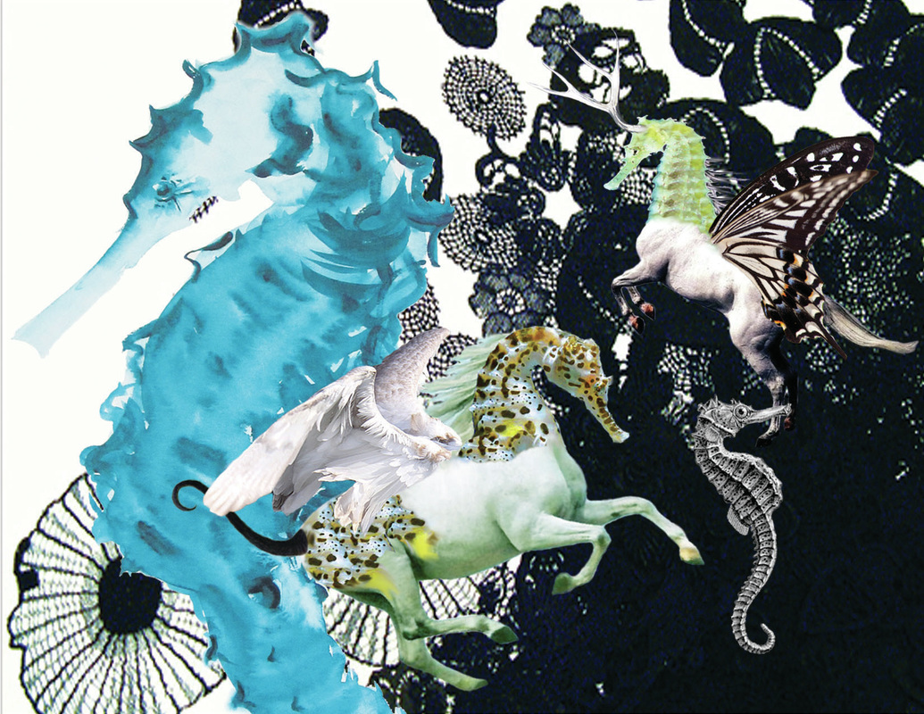
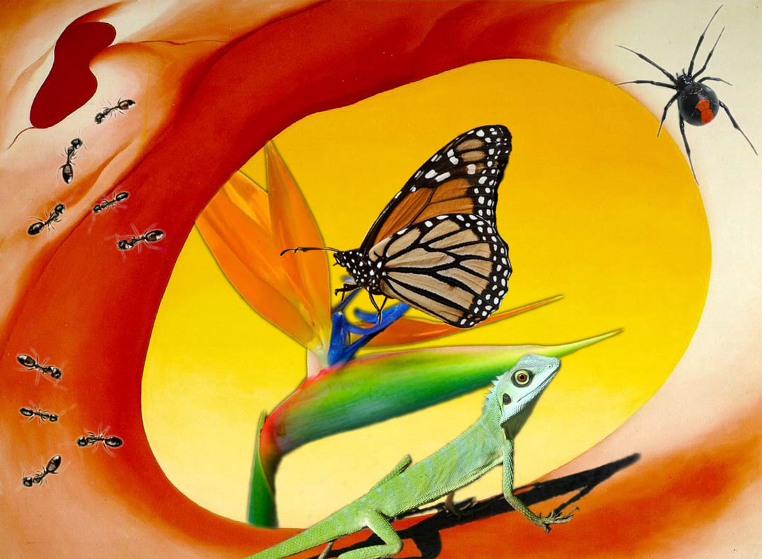
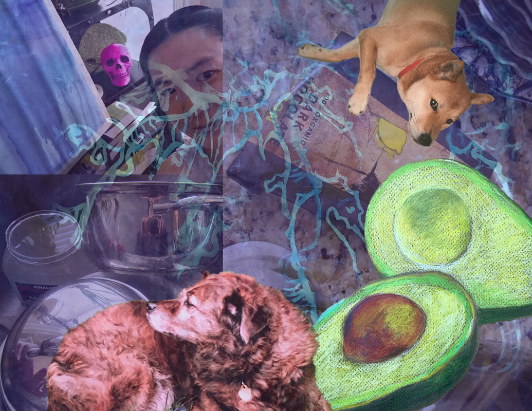
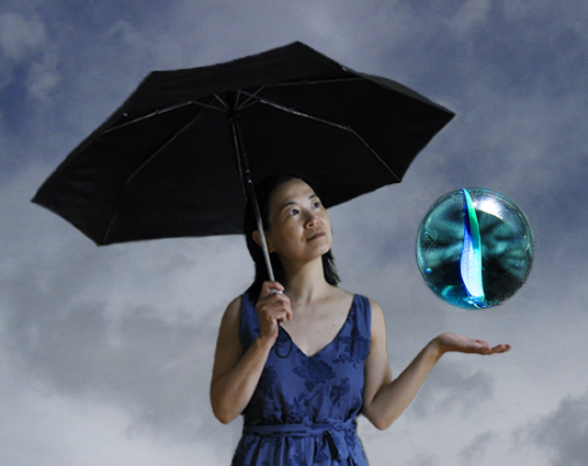
I learned how to code in HTML and styled in CS3 during a web design summer workshop at Rhode Island School of Design. Digital ImagingThe digital images below have been edited and transformed in Photoshop unlike my digital photography. I experimented with creating composites or collages by combining a variety of elements like pieces from a painting or vintage photographs. Sometimes I would play with filters but most of the time I try to enhance the photographs by adjusting its brightness or contrast. My emphasis is more on composition and hopefully the digital editing looks natural and convincing instead of cut up and pasted together like an ordinary collage with paper and scissors. Conceptually the technique is very similar but the result should not look like pictures cut out from a magazine.
|